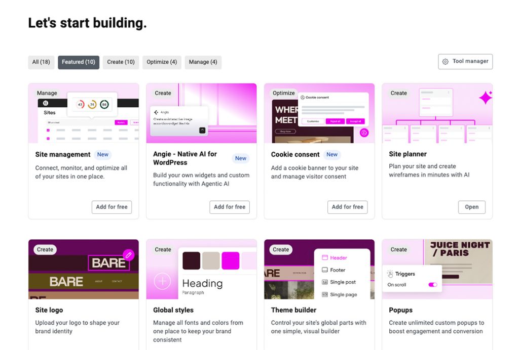
Elementor V4 has been the official release since March 2026, so this isn’t a first look. It’s a proper stocktake of how the Atomic Editor holds up once agencies and freelancers have had a few months to actually build with it. You might have seen this update called Elementor V4, Elementor Editor V4 or the Atomic Editor. They all mean the same thing.
The short version is that V4 moves away from styling widgets one at a time and introduces a shared system built on Atomic Elements, Classes, Variables and Components. Nothing happens to your existing site automatically, and V3 and V4 can run side by side. What follows is what’s genuinely different, what’s improved since launch, and where the gaps still sit.
What Changed Between V3 and V4
V3 built pages from sections and columns, a structure based on percentages and fixed gutters that worked well enough until you needed something more precise. Each widget carried its own bundle of settings and its own layer of nested HTML underneath, which meant a lot of duplicated styling across a site.
V4 strips that back. Instead of dozens of ready-made widgets, you compose pages from a smaller set of Atomic Elements: Div Block and Flexbox Container for structure, and Heading, Paragraph, Button and Image for content. The difference shows up clearly in the code. A V3 button could sit wrapped in three or four nested divs before you reached the actual link. The same button as an Atomic Element outputs with a single wrapper.
That’s not just tidier. Less code for the browser to parse plays into Core Web Vitals, and a lighter DOM is easier to work with when troubleshooting a layout or handing a site to a developer. DOM bloat is only one factor in performance though, and if you’re chasing every gain, our breakdown of what typically slows an Elementor site down covers the rest of the picture.
Classes, Variables and Components: The System Behind V4
This is where the real shift sits, and it’s the part that gets glossed over in a lot of coverage. V3 encouraged you to think element by element. V4 rewards thinking in systems first, then applying them.
Classes are reusable style collections. Set the styling once, apply it to as many elements as you like, and update it in one place when something needs to change. A dedicated Class Manager gives you a central view of every Global Class on the site, where you can rename, reorder or delete them without hunting through individual elements.
Alongside Classes sit States, essentially pseudo-classes for the visual editor. You can define exactly how an element looks on hover, focus or active, without writing custom CSS.
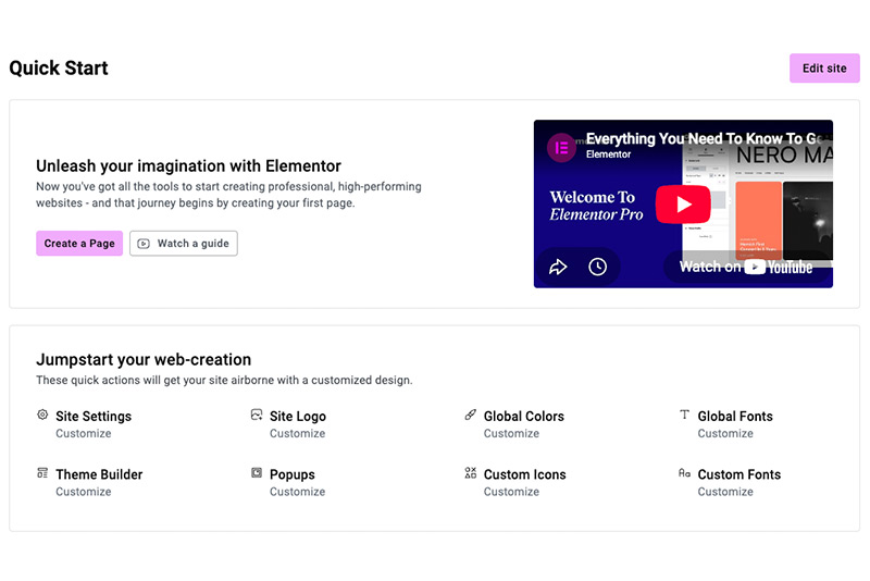
Variables take the same logic further. Rather than setting a colour, font or size manually on every element that needs it, you define it once as a Variable, such as a primary colour or a heading font, and connect elements to it. Change the Variable and every element using it updates at once, which matters if your Suki brand colours or client’s brand assets ever shift.
Components, a Pro feature, let you turn any container into a reusable layout block, complete with its own identity. Edit a Component once and every instance across the site updates, while still allowing controlled per-instance customisation for things like the specific text or image in each version. For anyone maintaining a website with a lot of repeated sections, that’s a meaningful time saver.
You might also find this helpful
Flexbox-First Layouts
Getting proper Flexbox behaviour in V3 usually meant reaching for custom CSS, since the section-column structure fought back the moment you wanted a column to grow, shrink or wrap in a specific way.
V4 puts full Flexbox control directly into the visual editor. Direction, alignment, spacing and wrapping are all adjustable settings that update immediately, without leaving the panel. For anyone who has spent time wrestling a stubborn column layout on mobile, this is the change that affects daily workflow the most.
You don’t need to rebuild existing containers to get this. V3 sections keep working as they are, and you can introduce Flexbox Containers on new sections or pages while leaving older ones untouched. If a full rebuild rather than a gradual switch makes more sense for your site, that’s the kind of project our web design team takes on regularly.
The Unified Style Tab and Per-Device Control
Every Atomic Element shares the same Style Tab, rather than each widget carrying its own separate panel. Content and functionality settings stay in the General Tab, while colour, spacing, typography and borders live in Style. Learn the system once and the panel for the next element is already familiar.
The bigger change sits underneath that consistency. In V3, only specific controls had responsive settings, so certain properties couldn’t be adjusted per device without custom CSS. In V4, every style property can be set independently for desktop, tablet and mobile, with no exceptions. That’s a genuine shift for anyone who has needed to hide a border on mobile or adjust padding at a specific breakpoint and found the control simply wasn’t there.
New Since Launch: Atomic Tabs, Forms and Interactions
V4 hasn’t stood still since March. Elementor has continued adding capability release by release, which is worth knowing if you looked at V4 early on and assumed what you saw then is all there is now.
Atomic Tabs arrived as one of the more requested additions, breaking the traditional tabs widget into separate elements you can style individually, including a dedicated Selected state for active tab triggers. Entrance Interactions followed, giving you scroll or load-triggered fade, slide and scale effects that can be configured per breakpoint, so motion on desktop doesn’t have to behave the same way on mobile.
On the Pro side, Atomic Forms rebuilt the forms widget so that labels, fields and buttons are individual draggable elements rather than settings buried in a single widget panel. That opens up multi-column forms and nested layouts without custom code, something V3’s forms widget never made easy. Pro users also get access to Interactions beyond entrance animations, with triggers that respond to scrolling, hovering and clicking.
The pattern worth noting is that V4 is being filled in gradually rather than delivered complete. If a specific widget or capability isn’t there yet, it’s worth checking Elementor’s release notes before assuming it can’t be done.
You might also find this helpful
What’s Still Missing in V4
This is the part that gets skipped in a lot of write-ups, and it’s worth being upfront about it. Several common widgets aren’t yet available as Atomic Elements, including accordions, galleries, carousels and grid or list layouts. If a project depends heavily on any of these, V4 isn’t quite there yet for that specific job.
Custom CSS support within the Atomic system is also more limited than in V3, which matters if your workflow has relied on dropping in custom code for anything the widget settings didn’t cover. Rich text formatting inside Paragraph and Heading elements is more restricted too, with less support for inline HTML or list formatting than the equivalent V3 widgets offered.
Beyond the interface itself, builders working with early V4 projects have reported friction with third-party plugins and custom field integrations, particularly tools like ACF and JetEngine that many sites rely on for custom post types and dynamic content. None of this makes V4 unstable. It’s a genuine, production-ready release. But it does mean checking your specific requirements against what’s currently available, rather than assuming everything from V3 has a direct equivalent yet.
Should You Switch to Elementor V4 Now?
For a new site, starting on V4 generally makes sense. It’s stable, it’s the default for fresh installs, and building with it from day one avoids a migration conversation later, provided the widgets and workflows you need are actually there.
For an existing site, there’s no pressure to move everything at once. V3 widgets and V4 elements can sit on the same page, so you can introduce Atomic Elements gradually, starting with a new landing page or a section you’re rebuilding anyway, while the rest of the site carries on as normal. If a project depends on a widget or workflow that V4 doesn’t yet support, staying on V3 for now is a reasonable call rather than a sign of falling behind. Testing any changes on a staging site first is worth doing regardless of which version you’re building with.
A page builder update like this only pays off if the rest of the site behind it, its structure, its content and how it’s found in search, is doing its job too. If you’re weighing up a V4 rebuild or want a hand with the SEO side once it’s live, that’s exactly the kind of project we get stuck into. Get in touch through our contact page or book a free call to talk it through.